Posted: · Updated: · Author: Adam Welch
In the past two years, branding went through a loud phase. AI tools exploded. Maximalism pushed back against years of minimalism. Brands chased bold visuals to stand out in crowded feeds.
In this Article
- AI as Infrastructure
- Identity Systems Over Logos
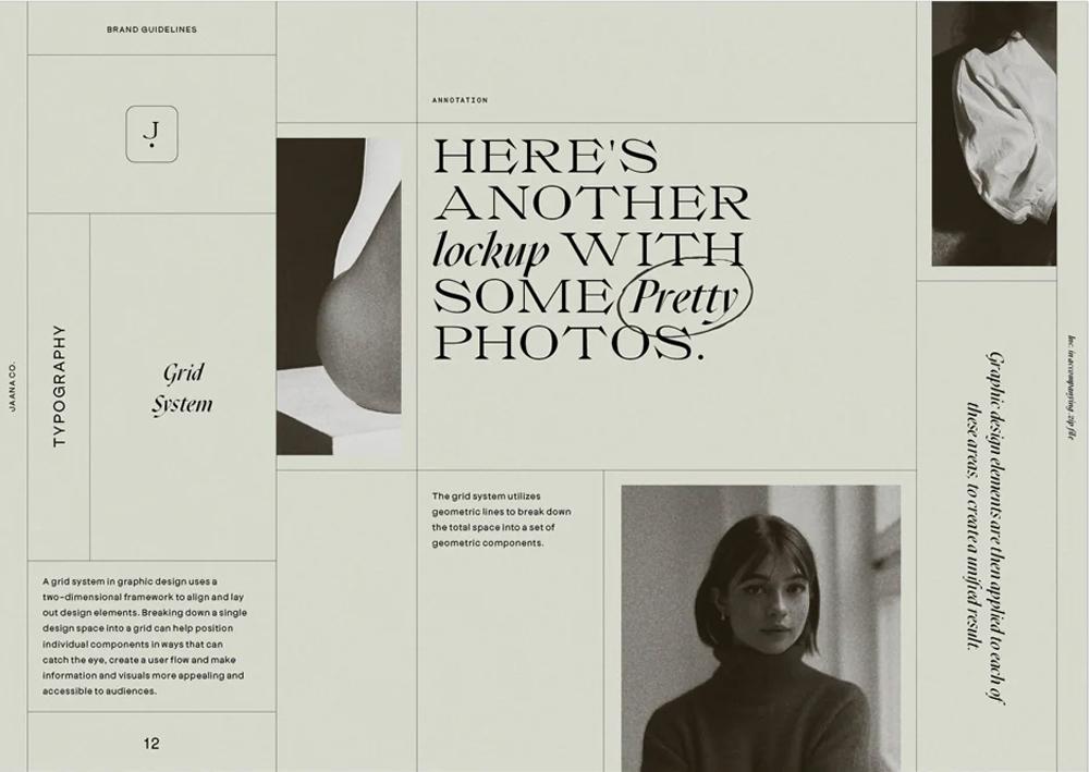
- Authority Typography
- Owned Visual Territories
- The Death of Safe Minimalism
- Expressive Wordmarks
- Editorial Brand Thinking
- Analog Imperfection
- Motion-Influenced Static Design
- Strategic Color Saturation
- Modular Brand Architecture
- Cultural Alignment Over Trends
- What's Fading in 2026
- Conclusion: Success in 2026
- Common Questions
In 2026, graphic design and branding are moving from experimentation to integration. AI is no longer a novelty. Consumers are more skeptical. Attention is shorter. Trust is harder to earn. In this climate, surface-level trends will not carry a brand very far.
The brands that win in 2026 will not be the trendiest. They will be the clearest, most consistent, and most distinctive. This is not a list of flashy styles. This forecast outlines the graphic design trends shaping branding in 2026 and their implications for businesses competing nationally.
Some of these shifts will feel familiar. Others may challenge what has felt safe for the past decade. All of them point to one truth: In 2026, brand systems will matter more than brand aesthetics. This graphic design trends 2026 forecast examines the branding shifts shaping visual identity systems across industries.
Here are the twelve trends that will define the year ahead.
AI as Infrastructure

Artificial intelligence will shape graphic design in 2026. But not in the way many predicted. The loud phase is ending.
In 2024 and 2025, brands experimented with visibly AI-generated visuals. Surreal images. Hyper-polished gradients. Impossible textures. At first, it felt new. Then it felt everywhere.
By 2026, consumers will recognize AI-looking design instantly. Recognition does not always equal trust. The real shift is happening behind the scenes. AI is becoming infrastructure.
Design teams are using AI to:
- Generate layout variations at scale
- Adapt brand assets across channels
- Refine typography pairings
- Speed up production workflows
- Test visual performance
But the final brand expression will feel more human, not less. In fact, the more AI supports the system, the more important human direction becomes. Brands that rely fully on AI aesthetics risk blending into a sea of sameness. Brands that use AI to strengthen consistency will gain efficiency without losing identity.
The bold prediction for 2026: AI will become invisible inside strong brand systems. And obvious AI visuals will begin to feel generic.
The advantage will not go to the brand that uses the most AI. It will go to the brand that uses AI quietly and strategically. For businesses, this means asking a different question. Not "How do we use AI in our branding?" but "Where can AI strengthen our brand system without changing how it feels?"
In 2026, AI is no longer the headline. It is the engine.
Identity Systems Over Logos

In 2026, that question becomes less important. The focus shifts from logo design to identity systems.
For years, branding conversations have revolved around logos.
- Should we modernize it?
- Should we simplify it?
- Should we remove detail?
Many brands already simplified their logos between 2018 and 2024. Flat marks replaced dimensional ones. Sans-serif wordmarks replaced ornate typography. The result was cleaner, but often less distinctive.
Now the next phase begins. Instead of redesigning logos again, brands will invest in building flexible systems around them. That means:
- Modular logo variations
- Defined typography hierarchies
- Structured color frameworks
- Repeatable layout patterns
- Consistent social and campaign templates
This shift is practical. Brands now operate across dozens of touchpoints. Social platforms. Digital ads. Email. Packaging. Events. Video. Sales decks. Internal documents. A logo alone cannot carry that load.
The bold prediction for 2026: We will see fewer dramatic logo overhauls and more brand system expansions.
Brands that already simplified their marks will resist changing them again. Instead, they will strengthen what surrounds them. The competitive edge will not come from a new symbol. It will come from cohesion.
This is where maturity shows. Strong identity systems allow a brand to scale without losing recognition. Weak systems rely on a logo to do too much heavy lifting.
For businesses, the question shifts from "Do we need a new logo?" to "Does our brand system function across every channel we use?"
In 2026, scalable identity will matter more than logo novelty.
Ready for the pros?
Learn about hourly support and monthly packages with a team of local professionals. That's right: real people to grow a relationship with.
Authority Typography
In a crowded digital world, type carries more weight than ever.
Consumers are scrolling fast. Content is endless. AI-generated copy and visuals are everywhere. In that environment, typography becomes more than style. It becomes a signal.
In 2026, typography will do one job above all others: build trust. We are entering a period shaped by economic caution and growing skepticism. People question what is real. They question what is established. They question what is credible. Design responds to that mood.
Expect to see:
- Modern serif typefaces in B2B and finance
- Higher contrast between headlines and body text
- Confident, bold typographic hierarchy
- Custom or semi-custom type systems
This is not about decoration. It is about authority.
Serif fonts are gaining ground because they feel rooted and established. Structured typographic systems feel intentional. Strong hierarchy signals clarity.
At the same time, thin, overly minimal sans-serif systems will start to feel fragile. What once looked sleek can now look generic or uncertain.
The bold prediction for 2026: Typography will become the primary anchor of brand credibility.
Brands that invest in distinctive type systems will stand apart from competitors still relying on default web fonts and template kits. For businesses, this shift matters. Typography touches every surface. Website headlines. Social graphics. Pitch decks. Packaging. Advertising. Internal materials.
When type is weak, the brand feels weak.
When type is confident, the brand feels established.
In 2026, typography will not just support branding. It will define it.
Owned Visual Territories
In 2026, blending in will cost more than standing out.
Over the past decade, many industries drifted toward visual sameness. Safe blue palettes. Clean sans-serif logos. Generous white space. Friendly stock photography. It felt modern. It also felt interchangeable.
That era is fading. As more brands adopt similar templates and AI tools, visual overlap increases. Feeds begin to look identical. Websites feel like copies of each other. Distinction erodes.
The brands that win in 2026 will not chase trends. They will claim territory. Owned visual territory means building a brand that is recognizable without a logo. That can include:
- A bold and consistent color system
- A proprietary illustration style
- A distinctive grid structure
- A recognizable photographic approach
- A unique typographic voice
The goal is not loud design. The goal is defensible design.
This shift is driven by competition. Attention is short. Consumers rarely read first. They recognize first. If your brand cannot be identified in a split second, it competes on price or noise.
The bold prediction for 2026: Brands that fail to define a clear visual territory will be forced into constant reinvention.
Brands that own territory will scale with consistency. This does not require extreme aesthetics. It requires discipline. Clear rules. Strong systems. Repetition across channels.
For businesses, the question becomes simple: If your logo were removed, would your brand still be recognizable?
In 2026, ownership will outperform imitation.
The Death of Safe Minimalism

Minimalism is not disappearing in 2026. But <em>safe minimalism</em> is losing power.
For years, brands stripped away detail in the name of clarity. Logos became thinner. Color palettes became softer. Layouts became lighter. The goal was simplicity.
At first, it worked. Then everyone did it.
By 2026, neutral palettes, thin sans-serif wordmarks, and wide white space will no longer signal confidence. In many industries, they already feel generic. What once looked premium can now look cautious.
The cultural mood has shifted. Audiences want clarity, but they also want conviction. They want brands that feel distinct, not polite. Minimalism is evolving into something sharper.
Expect to see:
- Stronger contrast in typography
- Bolder color choices within clean systems
- More intentional hierarchy
- Clear visual anchors instead of floating elements
The difference is subtle but important. It is not about adding clutter. It is about removing fear.
The bold prediction for 2026: Brands that cling to overly safe minimalism will struggle to stand out in saturated markets.
Brands that evolve minimalism into something confident and distinctive will feel modern without feeling trendy.
This matters because minimalism became the default for many industries. Tech. Finance. Professional services. Healthcare. When everyone looks calm and clean, no one looks memorable. For businesses, the question is not "Should we be minimalist?" It is "Does our minimalism say anything?"
In 2026, clarity alone is not enough. Distinct clarity will win.
Expressive Wordmarks
For years, many brands chased the perfect symbol.
A sleek icon. A clever mark. A geometric shape that looked modern and flexible. In some cases, it worked. In many others, it created confusion.
In 2026, clarity will outperform cleverness. As digital spaces grow more crowded, people have less patience to decode abstract marks. On a small screen, in a fast scroll, a symbol without context often disappears.
This is why expressive wordmarks are gaining strength. Brands are realizing that their name is their strongest asset. A distinctive wordmark builds recognition faster than a vague icon ever could.
Expect to see:
- Bolder typographic logos
- Custom lettering systems
- Confident spacing and structure
- Fewer abstract symbols standing alone
This does not mean icons disappear. It means they support the name, not replace it. The cultural driver is simple. Attention is short. Recognition must be instant. When consumers see your brand for less than a second, your name matters more than your symbol.
The bold prediction for 2026: Brands with abstract, hard-to-read icons will increasingly pair them with stronger, more dominant wordmarks.
Brands launching fresh identities will prioritize legibility and memorability over symbolism. For businesses, this is practical. A clear wordmark performs better across social feeds, digital ads, presentation decks, and small mobile placements. It scales more easily. It communicates faster.
In 2026, brand recognition will be built through clarity of name, not the mystery of a symbol.
Editorial Brand Thinking
In 2026, strong brands will think less like advertisers and more like publishers.
For years, many companies treated branding as a fixed system and marketing as a separate layer. Branding was the logo and colors. Marketing was the campaign.
That line is fading. Brands now live across social feeds, newsletters, landing pages, digital ads, video, and live events. The visual system must support constant storytelling.
This is where editorial thinking comes in. Editorial brand systems borrow from magazines and media platforms. They focus on structure, hierarchy, and rhythm.
Expect to see:
- Strong headline systems
- Clear content tiers
- Consistent layout grids
- Flexible but recognizable templates
- Campaigns that feel serialized, not isolated
Instead of reinventing visuals for every campaign, brands will build structured systems that allow stories to evolve within a defined framework.
The cultural driver is content saturation. Consumers are exposed to thousands of messages each day. Brands that feel chaotic get ignored. Brands that feel organized feel credible.
The bold prediction for 2026: Brands without clear editorial structure will struggle to scale content without diluting their identity.
Brands that build narrative-driven design systems will create recognition through repetition and rhythm. For businesses, this matters because content is no longer optional. If your brand produces ongoing messaging, your visual system must handle it without breaking down.
In 2026, branding will not just be how a company looks. It will be how consistently it tells its story.
Ready for the pros?
Learn about hourly support and monthly packages with a team of local professionals. That's right: real people to grow a relationship with.
Analog Imperfection
As AI becomes more common, perfection becomes less impressive.
In the past two years, ultra-polished visuals dominated. Clean gradients. Perfect lighting. Flawless symmetry. At first, it felt advanced. Now it often feels artificial.
In 2026, subtle imperfection will signal authenticity. This does not mean messy design. It means intentional texture. Human touch. Small irregularities that remind people there is thought behind the system.
Expect to see:
- Film grain overlays
- Soft texture in backgrounds
- Slightly imperfect type treatments
- Organic line work
- Subtle distortion or depth
These elements add warmth without sacrificing clarity.
The cultural driver is AI fatigue. As automated tools generate endless polished visuals, people begin to crave signs of human direction. Texture suggests care. Imperfection suggests intention.
The bold prediction for 2026: Brands that feel overly synthetic will struggle to build emotional connection.
Brands that introduce controlled analog elements will feel more grounded and trustworthy. This shift will be especially strong in industries built on trust. Finance. Healthcare. Education. Professional services. In those spaces, warmth matters as much as clarity.
For businesses, this is not a call to abandon structure. It is a reminder that personality builds connection. A brand can be system-driven and still feel human.
In 2026, the most effective branding will balance precision with subtle imperfection.
Motion-Influenced Static Design

Brands no longer live in still environments.
Even if a logo appears on a business card, it will likely be seen first on a phone screen. Social feeds, short-form video, digital ads, and live presentations have changed how people experience design.
In 2026, even static branding will be shaped by motion. This does not mean every brand needs complex animation. It means design systems will be built with movement in mind from the start.
Expect to see:
- Typography that feels kinetic, even when still
- Layered layouts that imply depth
- Cropping that suggests motion beyond the frame
- Graphic elements designed to animate easily
Instead of treating motion as an add-on, brands will treat it as a core layer of identity. The cultural driver is platform behavior. Social platforms reward movement. Video dominates engagement. Static images compete against moving content. Design must account for that reality.
The bold prediction for 2026: Brand systems that are not built for motion will feel outdated faster than ever.
Brands that design for movement from the start will adapt more easily across digital channels. For businesses, this is about longevity. If your visual identity only works in static print formats, it will struggle online. A motion-aware system ensures flexibility without constant redesign.
In 2026, branding will not be defined by how it looks in one moment. It will be defined by how it moves across many.
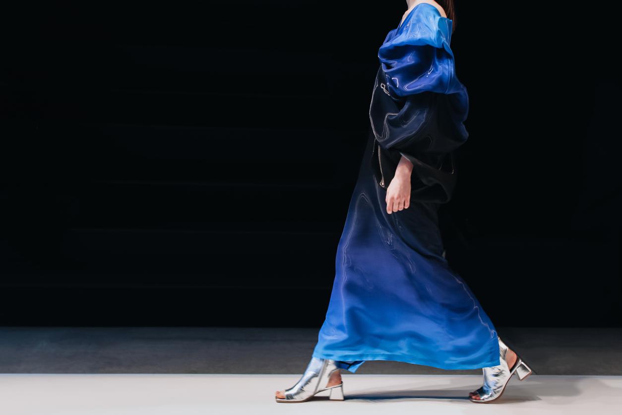
Strategic Color Saturation
In crowded digital spaces, muted brands fade first.
For years, many companies leaned into soft neutrals and restrained palettes. It felt modern and safe. But as more brands adopted the same approach, feeds became washed out.
In 2026, bold color will return with purpose. This is not about using every bright color at once. It is about owning a strong, confident palette and applying it with discipline.
Expect to see:
- High-contrast primary color systems
- Confident use of saturation in key brand moments
- Clear color hierarchy across touchpoints
- Fewer generic blue-and-gray combinations
Color is one of the fastest recognition tools a brand has. Before people read a headline or process a logo, they register color. The cultural driver is attention fatigue. Social feeds move fast. Visual impact must be immediate. Strong color creates that impact without adding clutter.
The bold prediction for 2026: Brands that continue to rely on overly muted palettes will struggle for recall in mobile-first environments.
Brands that define and defend a distinctive color system will improve recognition and consistency. This does not mean abandoning sophistication. A bold palette can still feel refined. The difference is confidence. Strategic color is not loud for the sake of noise. It is applied with clarity and repetition.
For businesses, this shift matters because color scales easily. Across social posts, email headers, event materials, and digital ads, a strong palette builds cohesion faster than any single graphic element.
In 2026, color will not be an accessory. It will be an anchor.
Modular Brand Architecture
Brands do not live in one place anymore.
They live on social platforms, in email campaigns, on packaging, inside slide decks, at trade shows, in digital ads, and across internal documents. Each space has different sizes, formats, and constraints.
In 2026, brand systems will be built like toolkits. Instead of a single rigid identity guide, companies will develop modular components that can adapt without compromising consistency.
Expect to see:
- Defined logo lockups for multiple contexts
- Flexible typography scales
- Clear content templates for recurring formats
- Pre-built visual components for teams to use
- Structured asset libraries
This is not just a design preference. It is a response to operational pressure. Marketing teams are moving faster. Content cycles are shorter. New platforms appear constantly. A rigid brand system slows growth. A modular system supports it.
The bold prediction for 2026: Brands with inflexible identity systems will either dilute their visual consistency or constantly redesign assets to keep up.
Brands with modular architecture will scale faster without losing clarity. This trend connects directly to AI infrastructure. As automation increases, systems must be clear enough for both humans and tools to execute consistently.
For businesses, the question becomes practical: Can your brand adapt across channels without looking fragmented?
In 2026, scalability will define maturity. A brand that cannot flex will fall behind.
Cultural Alignment Over Trends
The strongest brands in 2026 will not be the ones that follow every design trend.
They will be the ones who understand their audience. Graphic design trends reflect larger cultural shifts. Economic pressure. AI growth. Trust erosion. Platform fatigue. When brands chase visuals without understanding the forces behind them, their design feels temporary.
When brands align with culture, their design feels inevitable. In 2026, successful branding will start with questions like:
- What does our audience value right now?
- Are they seeking stability or disruption?
- Do they need clarity or inspiration?
- Are they overwhelmed or curious?
Trends can inform those answers. But they should not replace them.
The bold prediction for 2026: Brands that adopt trends without cultural alignment will look dated faster than ever.
Brands that anchor design decisions in audience psychology will outlast short cycles. This is where maturity separates strong brands from reactive ones.
A company in finance may lean into authority typography and structured systems. A lifestyle brand may embrace expressive color and analog texture. Both can be current. Only one will feel authentic if the strategy matches the audience.
For businesses, this final shift is critical. A rebrand is expensive. A visual refresh takes time and internal alignment. Trend-driven decisions without strategic grounding waste both.
In 2026, design will move faster than ever. The brands that thrive will slow down long enough to ask the right questions. Trends matter. Culture matters more.
What's Fading in 2026
Not every design movement survives the shift into 2026. Some trends that dominated the past few years are losing momentum.
1. Obvious AI Aesthetics
Hyper-slick gradients. Surreal composite imagery. Perfectly rendered but emotionally empty visuals. As AI tools become common, visibly AI-generated design will feel generic. Brands that rely on novelty alone will struggle to stand out. AI will stay. The "AI look" will fade.
2. Ultra-Thin Sans-Serif Logos
Overly delicate wordmarks and stripped-down typography once felt refined. Now they often feel cautious. In a climate that rewards clarity and confidence, thin, neutral logos lack presence.
3. Safe Corporate Blue
Blue is not disappearing. But generic blue-and-gray palettes are losing impact. As more industries adopt bold color ownership, neutral safety will feel forgettable.
4. Over-Simplified Brand Reductions
The mass flattening of logos and identity systems has reached saturation. Brands that reduced too far are beginning to reintroduce depth, structure, and personality.
5. Trend-First Rebrands
Perhaps the most important shift: rebrands driven purely by trend adoption will age quickly. In 2026, strategy-first branding will outperform trend-first branding.
Conclusion: Success in 2026
Graphic design trends move quickly. Brand systems endure. In 2026, success will not come from chasing every emerging style. It will come from building clarity, cohesion, and confidence into your identity.
The brands that stand out next year will not look the busiest. They will look the most intentional. If your organization is planning a brand refresh or evaluating your current system, now is the time to step back and assess what needs to evolve.
Was this article helpful?
Common Questions
The biggest graphic design trends in 2026 include AI-powered brand systems, authority-driven typography, modular identity frameworks, bold color ownership, and editorial-inspired layouts. The strongest shift is from aesthetic experimentation to structured brand systems.
Yes, but safe minimalism is fading. In 2026, minimalism evolves into something more confident and distinctive. Clean design remains relevant, but it must communicate personality and clarity to stand out.
Bold, saturated color systems are gaining strength. Brands are moving away from overly muted palettes and toward confident, high-contrast color ownership.
