Posted: Jul 29, 2025 · Updated: Feb 18, 2026 · Author: Adam Welch
A logo is more than just a visual mark. It's the face of your brand, the symbol customers associate with your business, and often the first impression you make. Whether you're launching a startup or refreshing your brand identity, getting your logo right is essential.
In this Article
Listen to this Article
But what makes a good logo? It's not about adding more detail or choosing the flashiest color. The most iconic logos in the world are often the simplest. Good logos are strategic. They blend design principles with brand personality to create something memorable, versatile, and instantly recognizable.
Simplicity

Why It Matters
A good logo should be easy to recognize at a glance. Simple logos are more versatile, easier to remember, and more effective across different media. Think of the Nike swoosh, the golden arches of McDonald’s, or the Apple logo. None of these designs relies on intricate patterns or fine details. Instead, they use clean lines and clear shapes that can scale from a tiny app icon to a massive billboard.
How to Apply It
- Stick to one or two design concepts.
- Avoid excessive detail or text.
- Limit the number of colors and fonts.
- Simplicity also supports clarity. If someone can sketch your logo from memory, that’s a good sign it's working.
Example: Nike
The Nike swoosh is one of the most iconic logos in the world, and it’s incredibly simple. Just a single curved checkmark shape, no text needed. It's instantly recognizable, scalable, and works in any color or context. The simplicity of the swoosh allows it to transcend language and culture. It communicates motion and energy without any explanation.
Memorability

Why It Matters
A great logo leaves an impression. If your audience sees your logo once and remembers it later, it’s doing its job. Logos that are too generic or overly complex tend to be forgettable. On the other hand, unique and focused designs tend to stick.
How to Apply It
- Use a distinct shape or icon that reflects your brand’s essence.
- Avoid clichés or overused symbols (like lightbulbs for ideas or globes for global businesses).
- Design with brand recall in mind, not just aesthetics.
- Memorability works hand-in-hand with simplicity. A clean, unique design stands out in people’s minds.
Example: Apple
The Apple logo (a stylized silhouette of an apple with a bite taken out) is unforgettable. It’s visually unique, and the small detail (the “bite”) makes it more distinctive and easier to recognize. Even without text or color, the Apple logo is instantly linked to innovation, design, and simplicity in consumers’ minds.
Ready for the pros?
Learn about hourly support and monthly packages with a team of local professionals. That's right - real people to grow a relationship with.
Relevance
Why It Matters
Your logo should align with your business, industry, and target audience. A fun, playful logo might be perfect for a toy company but entirely off-brand for a financial advisor. The goal is to strike the right tone. Your logo should reflect your brand’s personality and values while appealing to your ideal customer.
How to Apply It
- Choose colors, fonts, and imagery that reflect your brand identity.
- Consider your target audience’s preferences.
- Make sure the style aligns with your industry norms without blending in completely.
- Relevance ensures your logo communicates the right message at first glance.
Example: FedEx
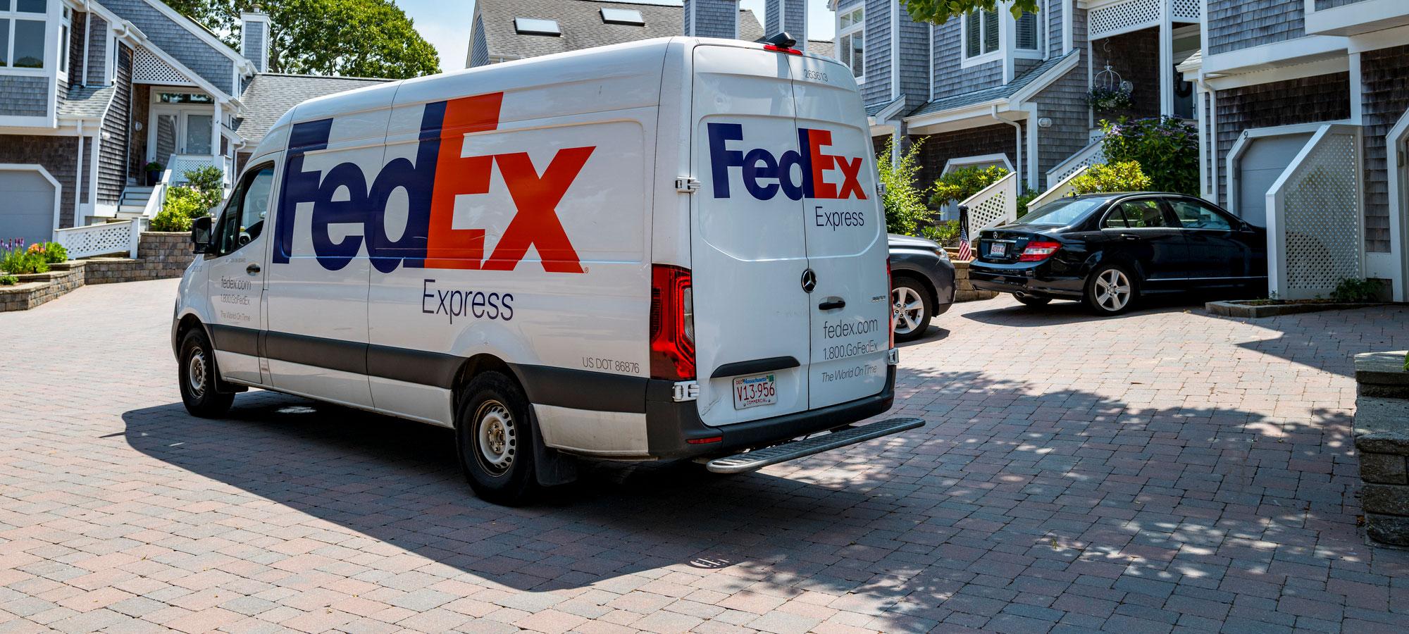
The FedEx logo uses a bold, clean font and includes a hidden arrow between the “E” and “x” to symbolize speed and precision, both central to the company’s logistics business. It visually aligns with the brand’s promise of reliable and fast delivery, which resonates with customers.
Versatility

Why It Matters
A good logo works in many different contexts: print, digital, social media, product packaging, signage, and more. It should look just as strong in black and white as it does in color. If your logo only works in full color or becomes unreadable when scaled down, it may not be ready for real-world use.
How to Apply It
- Design in vector format so it scales without losing quality.
- Test your logo in different sizes and backgrounds.
- Make sure it works in black and white, grayscale, and inverted versions.
- Ideally, your logo should be effective in horizontal, vertical, icon-only, and full lockup versions.
Example: McDonald’s
The golden arches are instantly recognizable whether they’re on a highway sign, a kids’ toy, a smartphone app, or a food wrapper. The “M” logo functions equally well in red, black, white, or yellow. It maintains clarity and impact across different sizes, formats, and cultures.
Timelessness
Why It Matters
Design trends come and go. What looks trendy today might feel outdated in a few years. A timeless logo helps your brand stay relevant without needing frequent redesigns. Of course, some evolution is natural as your business grows. But your core logo should have a long shelf life.
How to Apply It
- Avoid relying on trendy fonts, gradient effects, or overly modern styles that may not age well.
- Focus on classic design principles like balance, proportion, and symmetry.
- Study iconic logos from major brands and notice how they’ve stood the test of time.
- Timeless logos help you build a brand that lasts, reducing the need for frequent rebranding.
Example: Coca-Cola
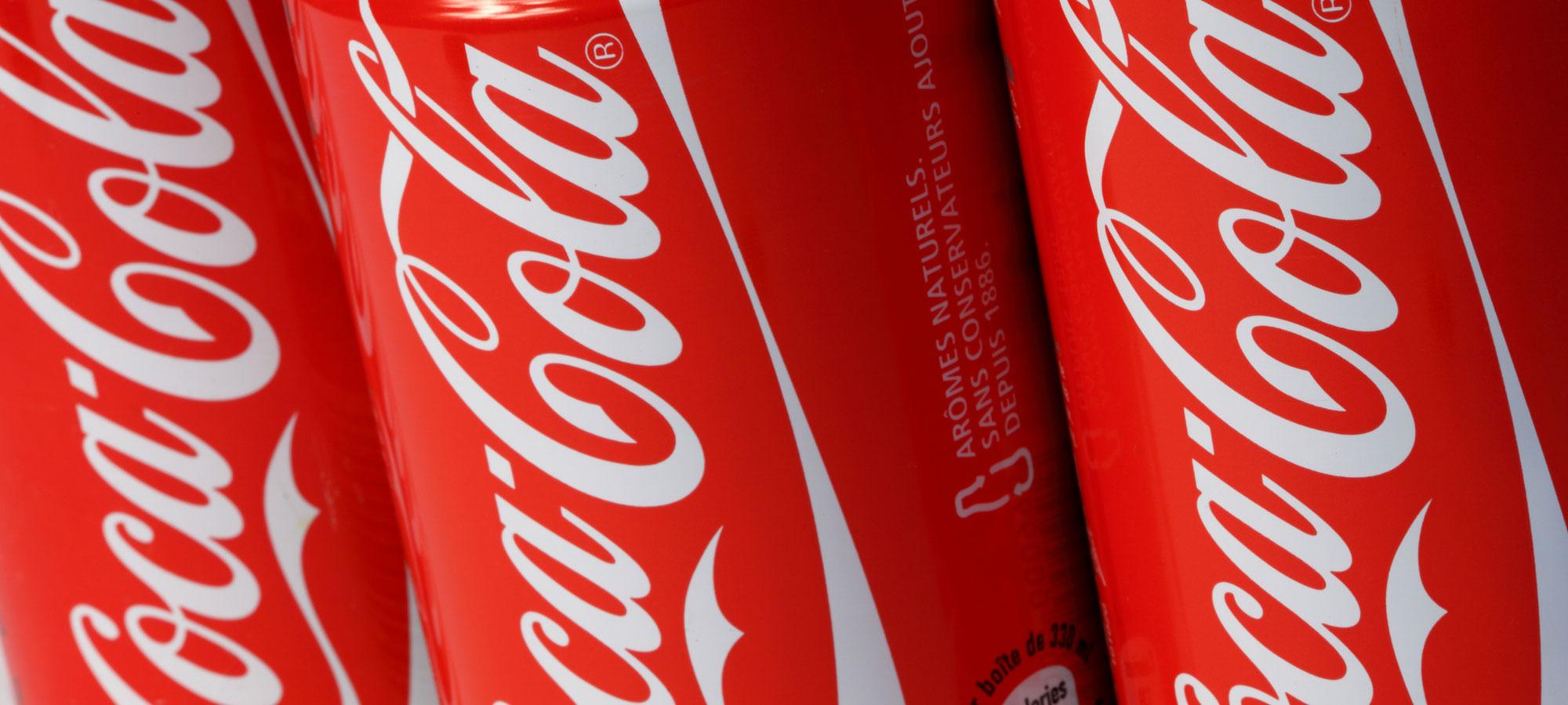
While Coca-Cola has made minor tweaks over time, its core script font and red color have remained nearly unchanged for over a century. The logo taps into nostalgia and heritage while still feeling relevant today. It has avoided design fads, focusing instead on classic appeal.
Uniqueness

Why It Matters
With millions of businesses out there, your logo needs to set you apart. A unique logo helps you stand out in a crowded marketplace and prevents confusion with competitors. Originality also protects your brand legally. A generic or copied logo can lead to trademark issues or lost credibility.
How to Apply It
- Research to see what competitors are using.
- Avoid template-based designs if you want true differentiation.
- Hire a designer who can craft a logo tailored to your brand story.
- If someone can confuse your logo with another company’s, it's time to rethink the design.
Example: Spotify
Spotify’s logo (a circle with three curved lines) represents digital sound waves and connectivity. It’s a symbol not commonly used in the music industry when it launched, giving it a fresh identity. It was distinct from CD imagery, musical notes, or headphones, which were overused by competitors. The logo stood out in a crowded market.
Scalability
Why It Matters
Your logo needs to function well across a wide range of applications. That includes everything from tiny favicons to huge banners, and from websites to business cards. Scalability is related to versatility but focuses specifically on performance at different sizes and resolutions.
How to Apply It
- Design in a grid system for consistent proportions.
- Create a simplified version (logo mark or icon) that still works without text.
- Ensure all elements are legible even at small sizes.
- A logo that loses clarity or meaning when resized isn’t practical for modern businesses.
Example: Twitter
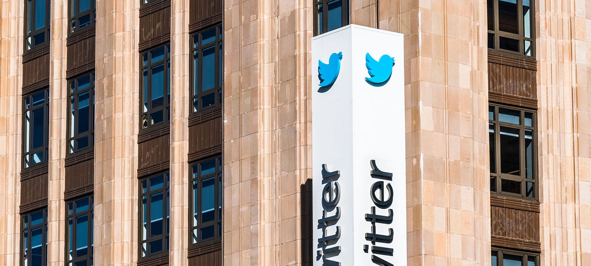
The original Twitter bird logo worked at every scale, from mobile app icons to large signage. The clean, geometric design kept its clarity whether it was printed or used digitally. It could be recognized even at a small size, without losing detail, making it perfect for app stores and social media buttons.
Conclusion
A good logo isn’t just about how it looks; it’s about how it works. The best logos are simple, memorable, relevant, versatile, timeless, unique, and scalable. They communicate your brand’s identity in a way that connects with people, builds trust, and leaves a lasting impression.
If you’re creating a logo for your business, take your time with the process. Use these seven key elements as a checklist. And if you're working with a designer, make sure they understand your brand and share your vision. Your logo is one of the most important investments you’ll make in your business. Done well, it can anchor your brand for years to come.
Common Questions
The cost of a professional logo design can vary widely depending on who you hire and the scope of the project. Design agencies may charge $2,500 or more. The investment often reflects the level of research, strategy, and customization involved.
There’s no one-size-fits-all answer. Many strong logos use a combination of text and a symbol, but it depends on your brand. A wordmark (text-only logo) might be best for businesses with unique names, while a symbol can help create a more recognizable icon. Ideally, your logo should work with both versions.
Yes, many online platforms like Canva and Adobe Express allow you to create a basic logo. These can be useful for early-stage startups or side projects. However, for a long-term brand identity, working with a professional designer can result in a more strategic and unique logo that sets you apart.
Related Stories
Latest Trends in Graphic Design: Defining 2025The Pitfalls of Using AI for Logo DesignLogo vs. Brand: What's the Difference?Digital Accessibility in GovernmentTrending Stories
Latest Trends in Graphic Design: Defining 2025WCAG 2.2 Changes + Rules ExplainedGraphic Design Trends 2026Related Services
Branding + LogosGraphic DesignLocal AdvertisingMarketing SolutionsCommercial PhotographySearch OptimizationVideo ProductionWebsite Design


