— Brand —
Fleshing out PLT's identity
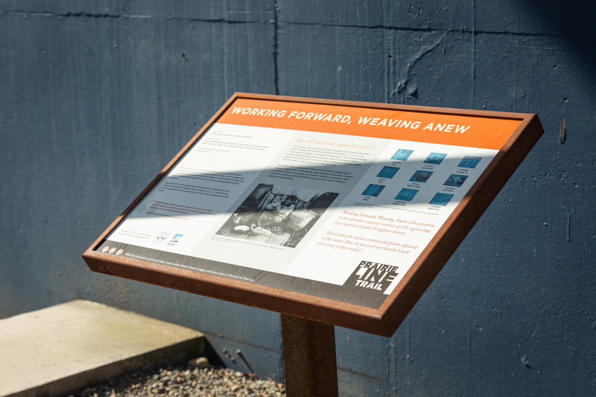
The first challenge facing us was the lack of a PLT brand. At the time of our web project, the Trail had one sign and no official logo. Referencing the unique look of the Prairie Line Trail sign, we fleshed out a logo, palette, and a collection of font choices, and crafted a tagline - Walk the Trails of Tacoma's History. These initial branding decisions guided us as we designed the website and interpretation signage for the art along the trail.
— Writing —
A story of time, place, and art
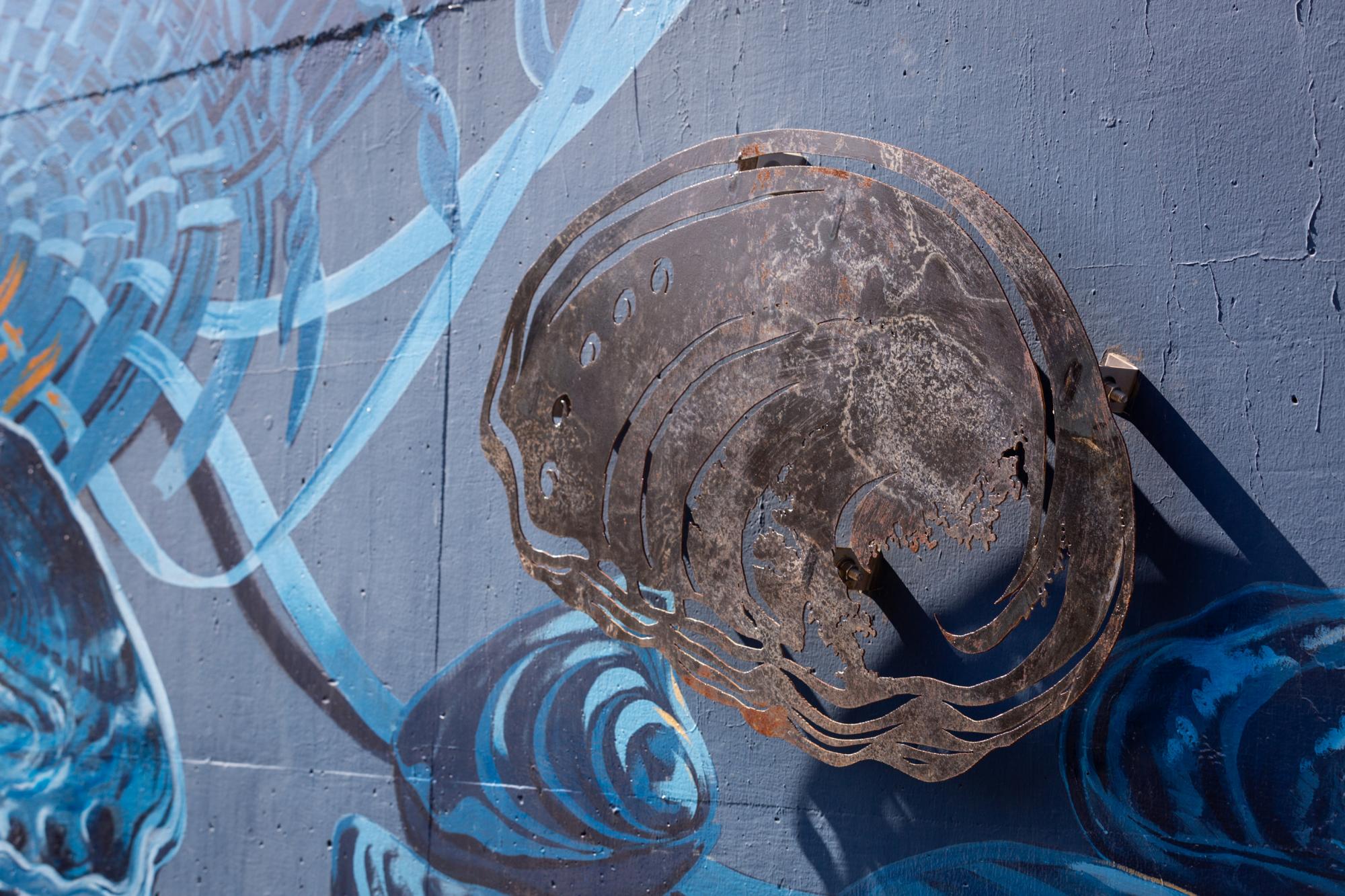
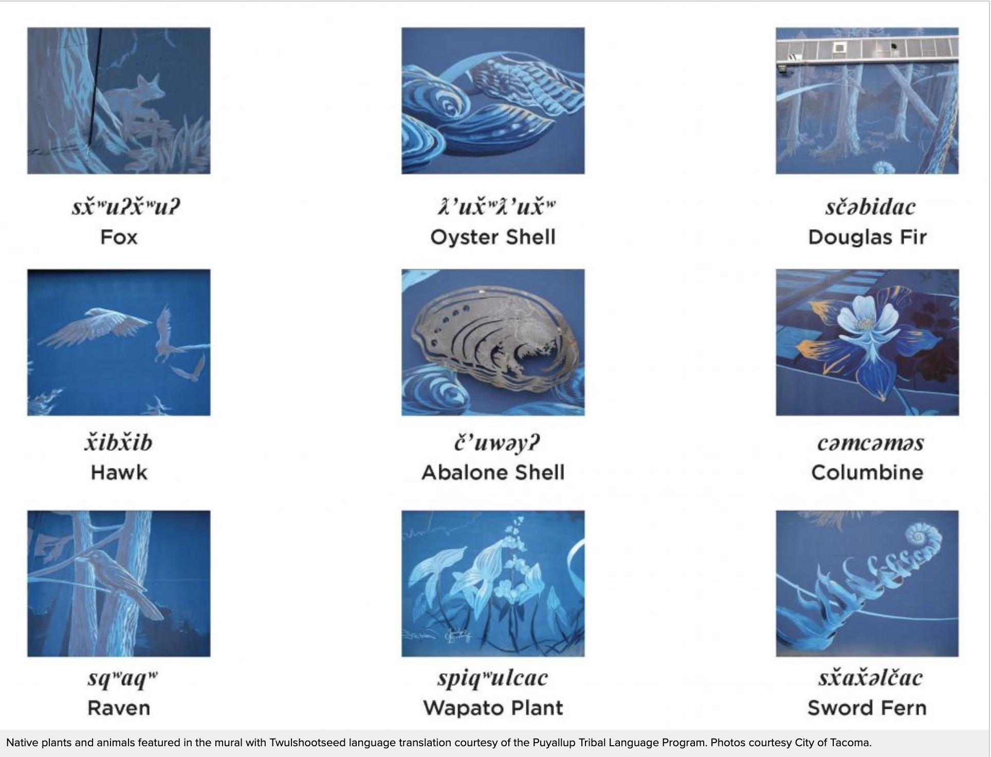
We started our writing and content strategy by walking the PLT with local experts to understand the storytelling opportunities offered by the Trail. Then we combed through reams of historical and artistic documentation, collaborating with artists, PLT experts, and local historians to create and rework the website content, bringing added life and meaning to the park's various points of interest through text, images, video, and other assets.
— Web —
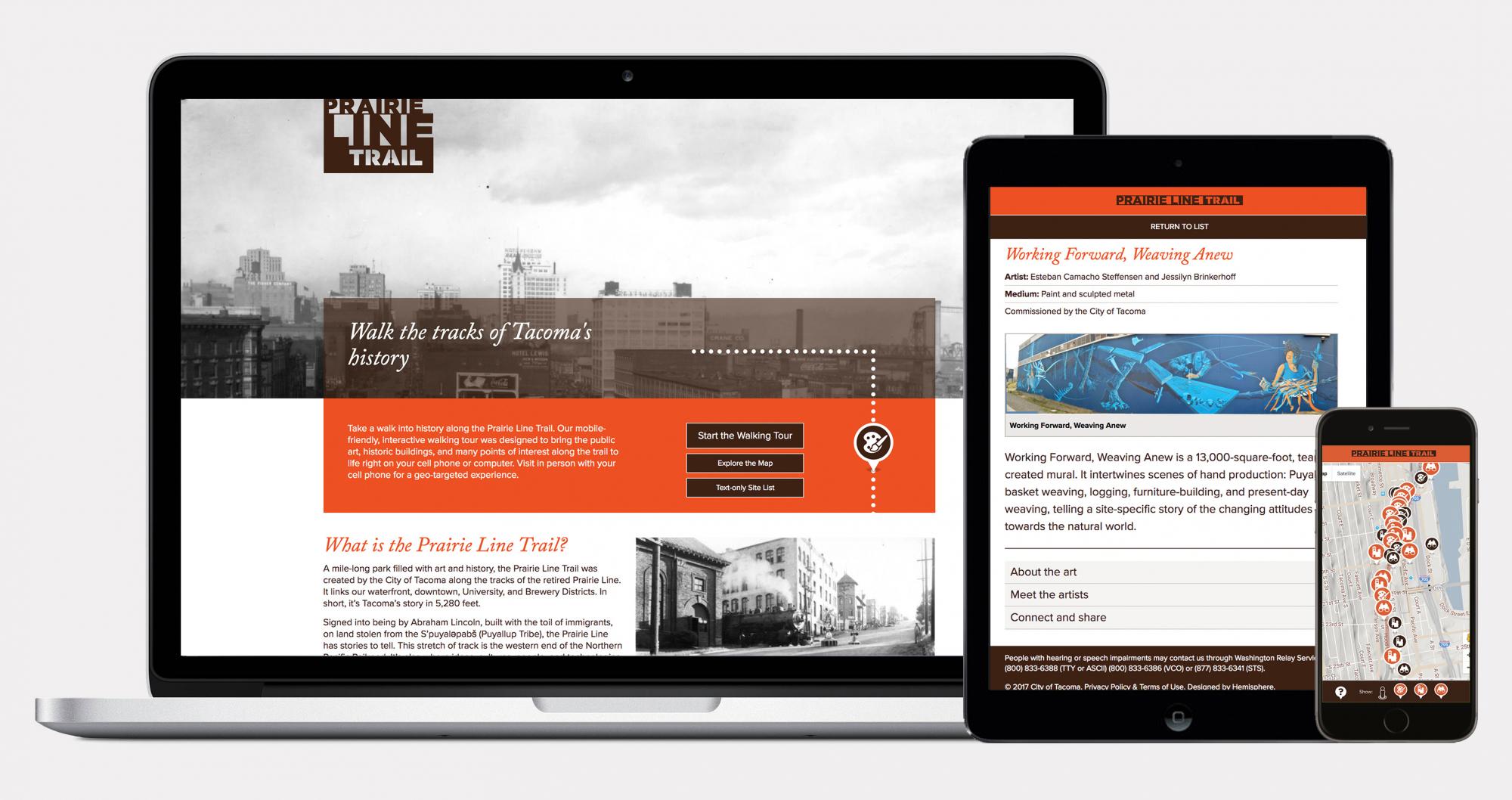
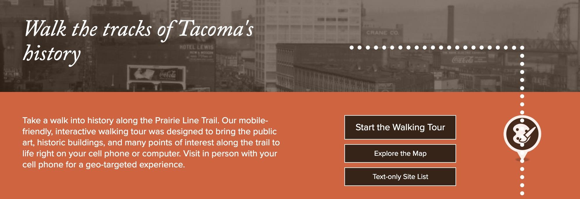
Interweaving physical and digital
To reach the broadest audience, we created a website with three "paths": a mobile experience with geo-targeted content that enriched user's understanding of sites along the trail, a desktop experience for remote viewing, and an ADA version for differently abled people. Critical to the user interface were a series of icons we created, helping people understand whether they were interacting with a historic site, public art, or some other point of interest.